How to make your website CONVERT and what is a “good” conversion?
So you want your website to actually get you ideal clients? These are my top 6 tips for how to make your website convert.
How to make my website convert:
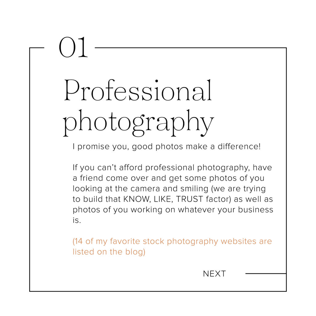
1. Professional photography
I promise you, good photos makes a difference! If you can’t afford professional photography, have a friend come over and get some photos of you looking at the camera and smiling (we are trying to build that KNOW, LIKE, TRUST factor) as well as photos of you working on whatever your business is.
I know branded photos can be costly, so if you are looking for a simpler solution, try stock photos.
Some of my other favorites? ÉLEVAE VISUALS (used to be Social Squares), PEXELS (free), UNSPLASH (free), STYLED STOCK HOUSE (used to be KATE MAX), IVORY MIX, and my absolute favorite is HAUTE STOCK (use code bekah to save 15% off your subscription).
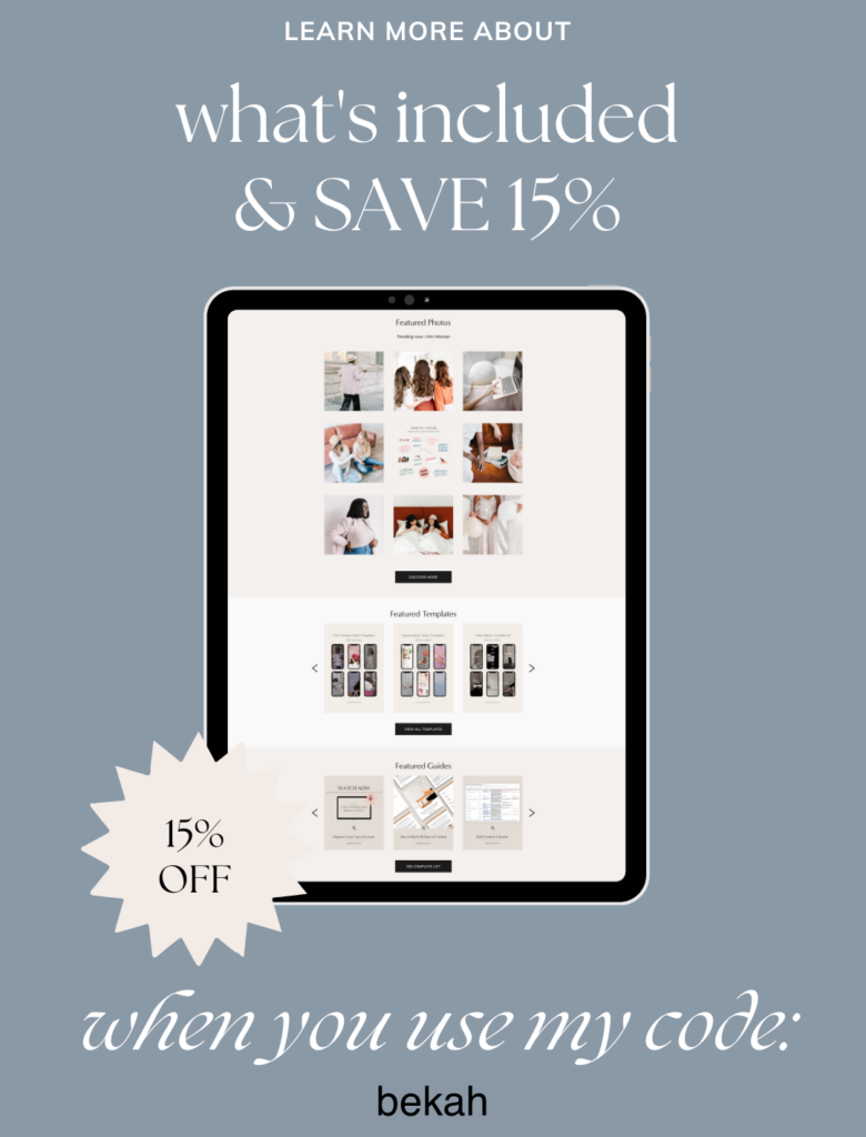
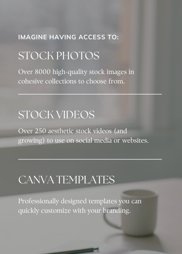
Here are other stock photography websites you could try: PIKWIZARD (free), WELLNESS STOCK SHOP (focuses on health and wellness), MOYO STUDIO, LIFE OF PIX (also free), STREET WILL (free), ISTOCK, PICSPREE, STYLED STOCK SHOP, and BACKDROP STOCK.
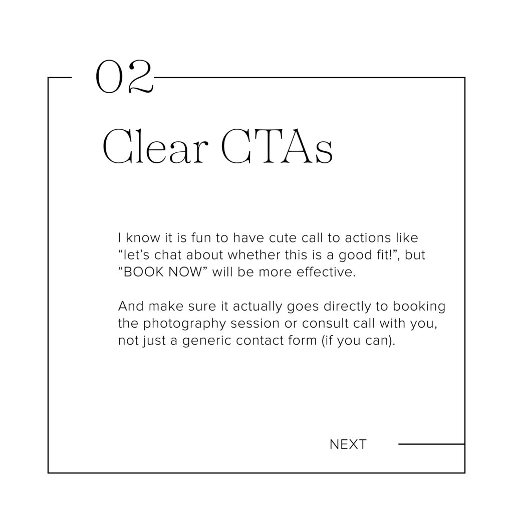
2. Clear CTAs
I know it is fun to have cute call to actions like “let’s chat about whether this is a good fit!”, but “BOOK NOW” will be more effective. And make sure it actually goes directly to booking the photography session or consult call with you, not just a generic contact form (if you can).
I use Dubsado as my CRM and embed a calendar that allows someone to book a 30 minute free discovery call with me. (NOTE – GET 20% OFF FIRST YEAR of Dubsado using code “bekah”).
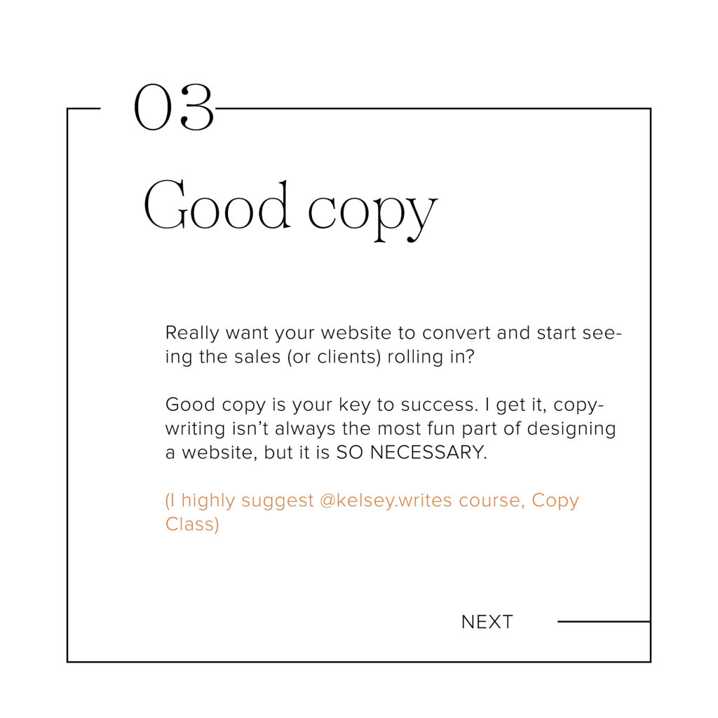
3. Good copy
Really want your website to convert and start seeing the sales (or clients) rolling in? Good copy is your 🔑 key to success. I get it, copywriting isn’t always the most fun part of designing a website, but it is SO NECESSARY. Copywriting is the key to success in making these conversions actually happen. 😬
Whether you currently have a website or not, I HIGHLY suggest Kelsey Formost* and her signature course, Copy Class.
Kelsey guides you through how to write words that SELL via your website, email marketing, and social media. This class will set your website up for success in terms of what to write and where.
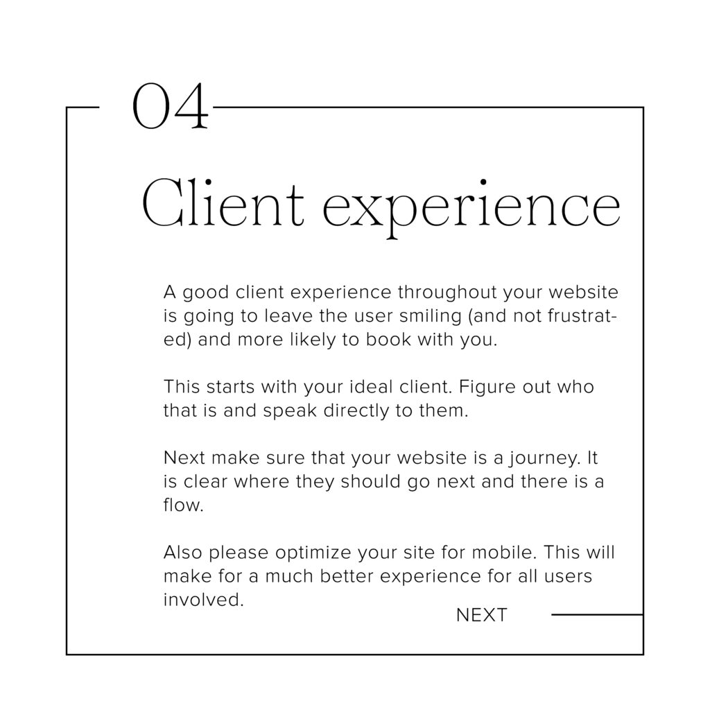
4. Client experience
A good client experience throughout your website is going to leave the user smiling (and not frustrated) and more likely to book with you.
What do I mean by “client experience”? First of all, it starts with your ideal client. Figure out who that is and then speak directly to them. Next make sure that your website is a journey. Maybe they land on the home page and then are guided to the about and then to the contact. It is all clear and there is a flow. Also please optimize your site for mobile. This will make for a much better experience for all users involved.
5. Build client trust (social media)
One way to do this (as mentioned above) is to have photos of YOU looking at the camera. Another way to build trust is by being active on your social media. Post the REAL YOU and build that know like trust factor. You can link your Instagram in the footer (if you are active on the platform) and it is the perfect place for people to go if they aren’t ready to buy from you, but want to stay connected.
6. Send deliverables via your website
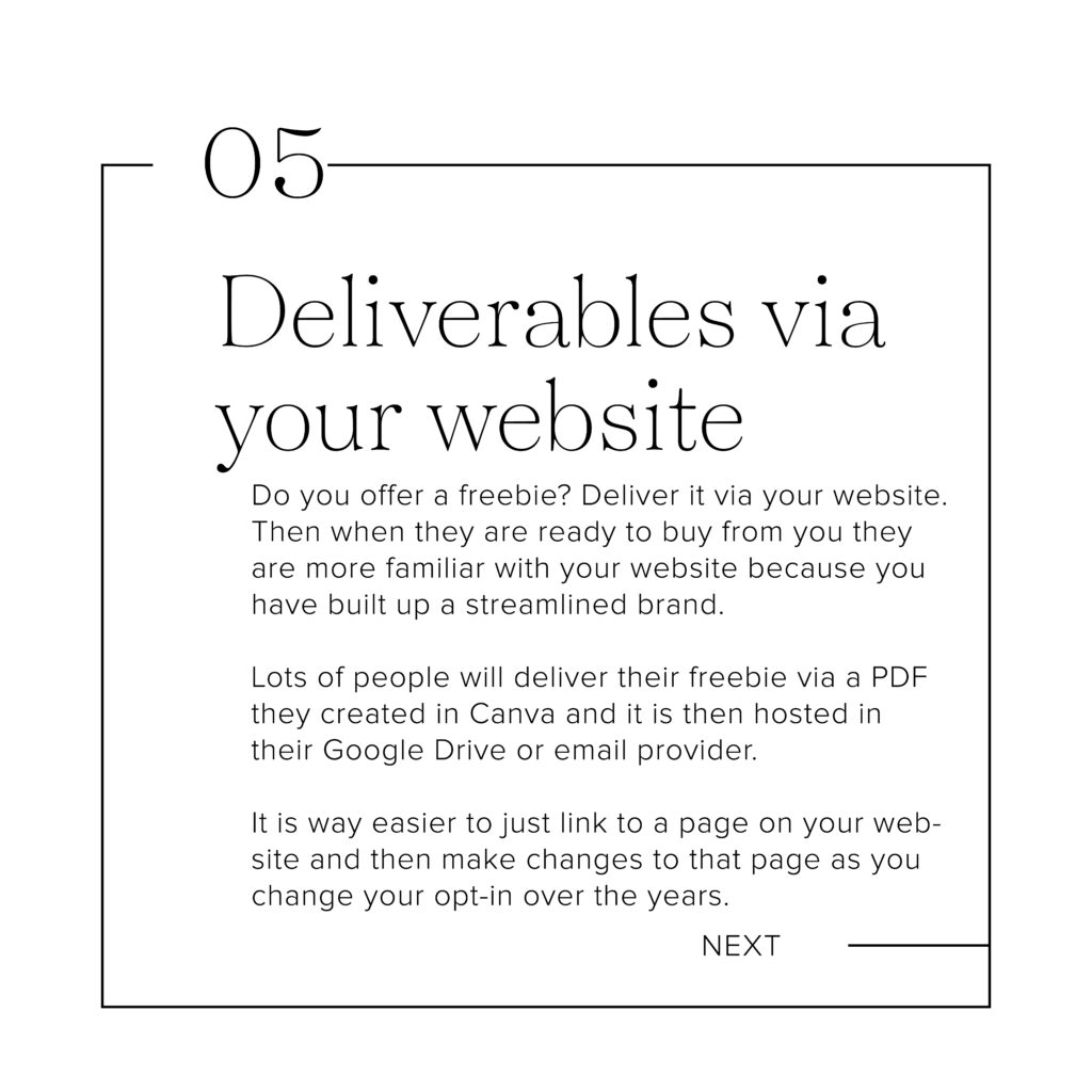
Do you offer a freebie? Deliver it via your website. Then when they are ready to buy from you they are more familiar with your website because you have built up a streamlined brand.
Lots of people will deliver their freebie via a PDF they created in Canva and it is then hosted in their Google Drive or email provider. The disadvantage to this is if you ever want to make changes to the freebie, you need to 1. go into Canva and edit it 2. Download it to your computer 3. Re-upload it to wherever it was hosted 4. Re-link the new document in your email sequence. It is way easier to just link to a page on your website and then make changes to that page as you change your opt-in over the years (which you probably will).
Thanks for the tips, but how do I know if my website works?
What is a “good” conversion?
Websites are great, but if they aren’t converting, they aren’t THAT great. I know as a creative entrepreneur you probably hate digging into the data, but here are a few things to look at:
What’s a conversion rate? NUMBER OF ACTION-TAKERS (CONVERSIONS) / NUMBER OF UNIQUE VIEWS x 100.
So if you want people to fill out the contact form – that is the action. Unique views (found in Google Analytics) is the visits to that page or sessions.
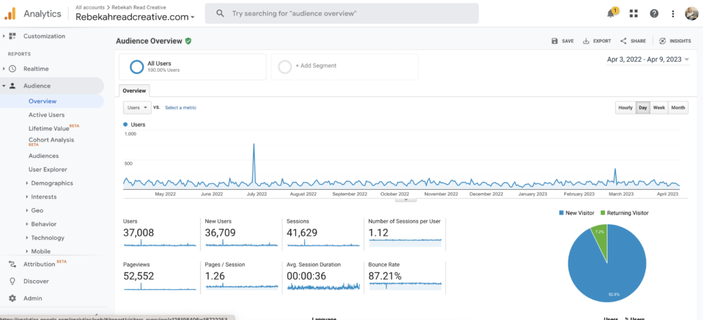
Read More: Learn about Google Analytics & what I track
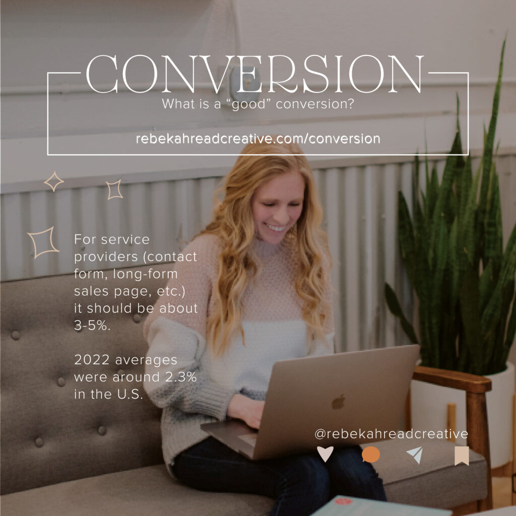
So for your website (this is for service providers – contact form, long-form sales page, etc.) it should be about 3-5%. 2022 averages were around 2.3% in the U.S.
Quick not: A “Freebies pages” (like this) usually convert a bit better. You can expect 20%-40%. This is because when people land on the page they usually are already desiring something from you and they were guided there from a referral (like Pinterest or Instagram). Whereas a home page may have shown up in Google search and may not be exactly what they wanted so they exit out (aka don’t convert).
Read more: If you are trying to come up with freebie ideas for your own business this year, make sure to check out this page full of resources.
Let’s chat launching real quick. I HATE launching, but I know it is what actually gets people in my courses (if you want to learn more about Squarespace With Confidence, click here). These are some good launch conversions:
- 30-35% of people who sign up for your webinar or challenge will attend
- 5-7% of your email list will purchase
- 30-50% will purchase on the last day of your launch
I’m overwhelmed Bekah… Give me some ACTION TIPS!
Well that wasn’t my intention… focus on one thing right now, like writing GOOD COPY that sells your work or service.
Again, I highly suggest Copy Class* as a starting place!
Here are some other website edits you could make:
- Scroll through your website and change your main button to “book now” and then direct that to a place where they can schedule with you a call or session
- Make sure your site is reading well on mobile
- Deliver your freebie via your website instead of a PDF in google drive or your email provider
* Affiliate Disclaimer – I am an affiliate, but would suggest this course either way! I went through it myself and LOVED it. It helped me not only create better website copy, but also email marketing copy.
Want more tips on making your website convert?
Read Next – How do you convert visitors to customers?
Other things I talk about on YouTube/ blogs:
I love providing Squarespace and Showit tutorials weekly for entrepreneurs who are trying to DIY their website. Many of my tutorials are related to:
- My favorite (easy) coding tricks
- Search Engine Optimization (SEO)
- Making style changes in Squarespace or Showit
- Website launching tips
- Email list/ Flodesk tips
Read other blogs about: Website Design
I’ve got messy hair and a thirsty heart.
I overshare my life, and have an ultra-expressive personality. Some words people use to describe me are: helpful, real, fun, creative, authentic, and kind.
Elphaba from Wicked is kind of my alter-ego (I was a fan LONG before the movie-adaptation - anyone else?!). I am always trying to forge my own path and make a difference in the World, somehow, someway, while also constantly criticizing myself and trying to become the better version of me.
Quality conversations + coffee come easy to me.
I’ve never had an issue connecting naturally with others (probs because I can go on and on about my life story, not that it is interesting, I just process externally...)