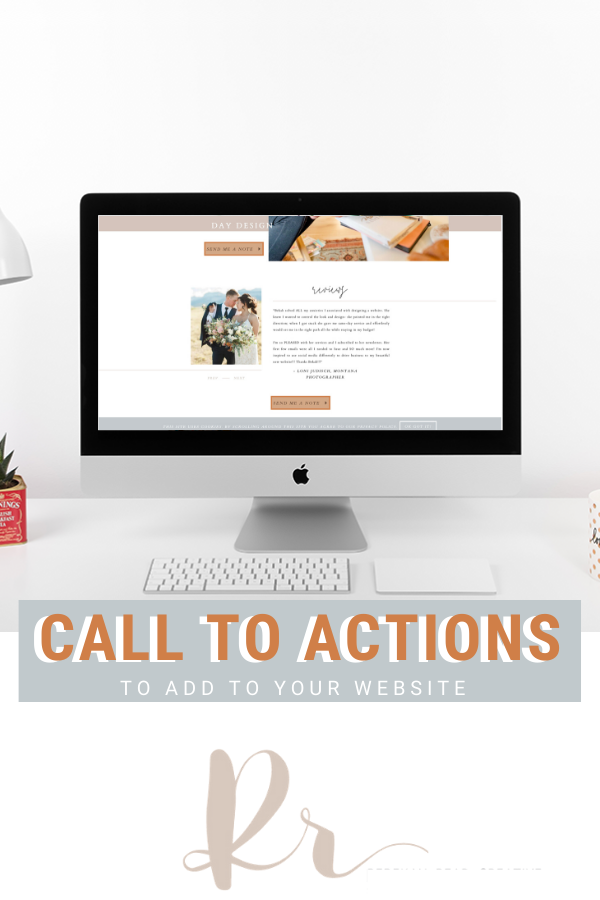
What Call to Actions to Add to Your Website
CTAs are the things in your website that ask people to take next steps. The 3 P’s of Call to Actions:
1. Don’t be passive
Click here. Inquire. Say yes. Let’s do this. These aren’t very clear. You want to be aggressive, but not invasive. I don’t want to look all over your site to find out how to schedule a call. So what are some things you SHOULD say? “Buy now” “Work with me” “Schedule a session” and “Book an appointment” are all great, non-passive CTA’s.
2. Be persistent
When someone hits a website you do a Z or F pattern so try to set up websites with that in mind – top left is logo and scroll to the right is first call to action. In the middle have another CTA and then of course at the bottom. People are easily distracted and will click away so don’t make them scroll to find the CTA. At least every 2 sections, have a CTA. Check out my home page! How many times do you see a CTA?
3. Pronounced
We have become super used to CTAs, so now it is our goal to make it extremely enticing. Make every Call To Action one color so your ideal client doesn’t need to think hard in order to take the next step. Another way to do it is to have a little bit of movement in your CTA – make it wiggle a bit or have a gradient that scrolls over when someone gets in that section. Or when you hover over, it turns to a GIF.
You can see what I did to make my button more pronounced at rebekahreadcreative.com
People coming to your website are coming at many different stages. It may be their first time and it may be their 10th, but if your CTA is direct, clear, and consistent, they can easily take that next step. Most studies say it takes someone 5-7 points of contact before they say yes, so you want something that when they come back it brings them along on a story and keeps them engaged and interested.
Another important thing to note is scannability. People don’t read websites, they scan websites (unless they are on the 4th or 5th time of landing on your site). So are you communicating what you need to say clearly and quickly?
Read the blog on website scannability
WANT MORE TIPS ON HOW TO MAKE YOUR WEBSITE CONVERT?
Free Training


Want more website resources?
Read other blogs about: SEO tips, Website Design
I’ve got messy hair and a thirsty heart.
I overshare my life, and have an ultra-expressive personality. Some words people use to describe me are: helpful, real, fun, creative, authentic, and kind.
Elphaba from Wicked is kind of my alter-ego (I was a fan LONG before the movie-adaptation - anyone else?!). I am always trying to forge my own path and make a difference in the World, somehow, someway, while also constantly criticizing myself and trying to become the better version of me.
Quality conversations + coffee come easy to me.
I’ve never had an issue connecting naturally with others (probs because I can go on and on about my life story, not that it is interesting, I just process externally...)