

How to Make Your Squarespace Website Mobile Friendly
READ THE UPDATED (Oct. 2024) POST HERE
~Guest Post by New Oceans Creative~
Today I’m going to walk you through my method on making a Squarespace website mobile friendly. While many website platforms these days are responsive and mobile friendly, there are instances when you’re going to have to work some coding magic to make your site look perfect on mobile.
Did you know that more than 50% of website traffic is coming from mobile these days! 😱
The importance of having your site mobile friendly is super important. When I’m on a website and it’s not lookin’ great (or maybe not even functional) on mobile, my web designer heart sheds a tear. Plus, Google has suggested that they prefer mobile responsive websites, and that they might get an SEO boost. WIN!
1. Use a mobile friendly template
Generally, all Squarespace templates are suitable for mobile, but there are certain templates I recommend because they have more options for mobile. These templates are:
- Brine
- Farro
These templates have specific mobile settings so you can optimize your site when it’s on the go.
2. Skip the Spacers
On most Squarespace themes, spacers are hidden on mobile. So that beautifully crafted, minimalist website with all the white space looks amazing on desktop, but on mobile it looks funky. I’ve been there.
Instead of relying on spacers, try changing the padding on elements to create white space. If this isn’t working for you, keep reading.
3. Adding Custom Code
Sometimes an element isn’t looking great on mobile, despite all the finessing. In this case I usually come in with a little bit of code. I’ll show you how to hide specific elements on mobile in just a bit, but first I wanted to show you how to hide an entire section.
When something isn’t looking great on mobile, I usually like to have two versions of the section that I need to edit. So for example, I will create a section that will only appear on desktop, and a section that will only appear on mobile.
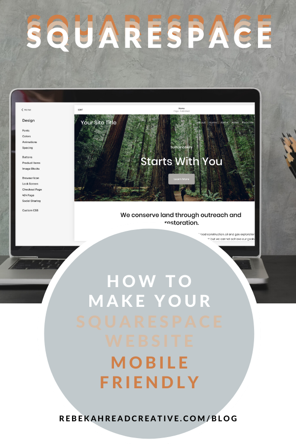
To add the following code to your Squarespace website, go to Design – Custom CSS.
If you’d like to hide an entire section on mobile, use the following code:
@media screen and (max-width: 600px) {
#section-name {
visibility: hidden !important;
display: none !important;
}
}
If you’d like to hide an entire section on desktop, use the following code:
@media screen and (min-width: 600px) {
#section-name-mobile {
visibility: hidden !important;
display: none !important;
}
}
I find this to be the most effective way of making Squarespace websites mobile friendly because I don’t have to sacrifice the desktop design, and everything is totally customizable!
Sometimes it’s easier to hide a single element rather than the entire section, and in that case you can use this code:
@media only screen and (max-width: 768px) {
#block-8fc91e9563250a77172c {
display: none;
}
}
To identify the block number for the element you want to hide, you’ll need a super special Google Chrome plug in to work some magic. You can download it here.
Once you install this plug in, navigate to your site on Chrome (you can’t do this in the editor). Click on this icon in your browser, and you will get all the block numbers pop up – like magic! 😉
Copy the block number of the element you want to hide, and plug it in to the CSS.
BOOM! You’re site is looking fresh and mobile friendly.
THANKS FOR THE POST
Read other blogs about: SEO tips, Squarespace
I’ve got messy hair and a thirsty heart.
I overshare my life, and have an ultra-expressive personality. Some words people use to describe me are: helpful, real, fun, creative, authentic, and kind.
Elphaba from Wicked is kind of my alter-ego (I was a fan LONG before the movie-adaptation - anyone else?!). I am always trying to forge my own path and make a difference in the World, somehow, someway, while also constantly criticizing myself and trying to become the better version of me.
Quality conversations + coffee come easy to me.
I’ve never had an issue connecting naturally with others (probs because I can go on and on about my life story, not that it is interesting, I just process externally...)

I find so much joy in helping and serving others and I give myself fully to whatever it is that engages me, whether that is running a 50k or creating a website in a day.


Hi Rebekah,
Looking to optimize my website for mobile responsive design. Is this a service you provide?
Best,
Nick
Hello Nick,
I don’t offer SEO or mobile optimization at this time. I have a Squarespace SEO course if you’re looking to improve your SEO which goes into mobile optimization. Let me know if you have any questions and best of luck!
Bekah