

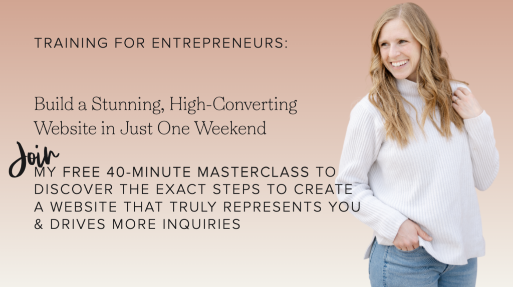
Website Best Practices: How to Make Your Site Work for You (Not the Other Way Around)
Your website should be your hardest-working employee—bringing in leads, making a great first impression, and guiding visitors toward the next step. But too often, creative entrepreneurs end up with a site that looks pretty but doesn’t actually do anything. If your website is more of a digital business card than a conversion machine, it’s time for a few strategic tweaks.
One of the main questions I get asked in my Facebook Group (Showit & Squarespace For Creatives) is website best practices – so this is for all of you website DIY’ers!
Here are my top website best practices to make sure your site isn’t just sitting there—it’s working for you.
1. The 3-Second Rule: Make It Instantly Clear What You Do
Within three seconds of landing on your website, visitors should know exactly who you are, what you do, and how you can help them. If they have to scroll, search, or guess, they’ll likely bounce.
Quick Fix: Make sure your headline is clear and client-focused. Instead of “Welcome to My Website,” try something like: Helping Creatives Launch High-Converting Websites—Fast.
2. Calls to Action That Actually Get Clicked
If your website isn’t telling visitors what to do next, they’ll do nothing. A strong call to action (CTA) is crucial for turning browsers into buyers.
✅ Make it clear: “Book a Free Call” is better than “Learn More.”
✅ Make it stand out: Use buttons, contrasting colors, or bold text.
✅ Repeat it: Don’t just put your CTA in one place—sprinkle it throughout your site.
3. Simplify Your Navigation (Because No One Likes to Hunt for Info)
Too many menu items = decision fatigue. Keep your navigation simple, clear, and no more than 5-6 main links.
Pro Tip: Your menu should guide visitors through your site naturally. If you have a “Work With Me” page, don’t bury it under a vague dropdown—make it easy to find.
4. Guide Visitors with a Clear User Flow
A great website doesn’t just look good—it effortlessly guides visitors toward taking action. Think of it like planning a trip: you need a clear destination and a step-by-step route to get there. Ask yourself, what’s the ultimate goal for your visitors?
❖ A purchase confirmation page?
❖ A thank-you page?
❖ A booked call?
Once you know the endpoint, work backward to ensure every click leads visitors closer to that goal. If your website journey feels confusing or disconnected, visitors will abandon it before reaching the finish line. Keep the path intuitive, simple, and free of unnecessary detours.
So many people focus on the design of a website, but a clear user journey (with a few tweaks to the design like adjusting spacing or refining typography can make a huge difference). Purpose of the site should be your primary focus.
5. SEO Basics: Get Found on Google (Without Overwhelm)
Your website can’t work for you if no one can find it. A few simple SEO tweaks can make a huge difference:
❖ Use keywords naturally in your headlines and copy (e.g., Showit website designer, Squarespace DIY website, website best practices).
❖ Rename your images with descriptive file names (not IMG_1234, but showit-website-template.jpg).
❖ Make sure your page titles and meta descriptions are clear and compelling.
❖ Make sure it is mobile-friendly; Google prioritizes this and let’s be honest—no one likes pinching and zooming to read text. Make sure the text size looks good, buttons are big enough, paragraphs are short, and it is easy to navigate
SEO doesn’t have to be scary—small steps add up over time!
6. Make It Feel Like You
A high-converting website doesn’t mean boring or robotic. Your brand’s personality should shine through!
✅ Use brand colors and fonts that match your vibe.
✅ Infuse personality into your copy—ditch the jargon and write how you talk.
✅ Add photos of YOU (not just stock images). People want to connect with a real person, not a faceless business. Better yet, build the know like trust factor with photos of you smiling and looking at the camera.
While we are on the topic of copy, let me just say that although I am a designer, IT IS THE WORDS THAT SELL! Speak to what your audience truly wants (more time, more freedom, to build something) and that will convert far better than a pretty site.
7. Homepage Essentials: What to Include (and What to Ditch)
Your homepage isn’t a catch-all for everything you’ve ever done—it’s a strategic guide to get visitors where they need to go.
🔹 A clear headline (who you are + how you help).
🔹 A strong call to action (book a call, shop now, etc.).
🔹 A brief bio (not your whole life story, just enough to build trust).
🔹 Testimonials or credibility markers (logos, social proof, press mentions).
What to ditch? Long paragraphs, vague language, and cluttered design.
8. Fast Load Times = Happy Visitors
A slow website is a conversion killer. People will leave if your site takes more than a few seconds to load.
Quick Fixes: ✅ Compress images before uploading.
✅ Remove unnecessary plugins or animations.
✅ Use a high-quality hosting provider for better speed.
9. Make It Easy to Contact You
If a potential client wants to reach out but can’t find your contact info, they’ll give up. Your contact page should be easy to find and simple to use.
🔹 Have a direct, easy-to-fill-out contact form.
🔹 Include your email (not just a form—some people prefer email).
🔹 If relevant, add a FAQ section to answer common questions upfront.
10. Your Website = A Work in Progress
Your website isn’t “one and done.” It should evolve as your business grows. Set a reminder to review your site every few months:
✅ Are your offers and services up to date?
✅ Is your messaging still aligned with your ideal clients?
✅ Are there any broken links or outdated pages?
Done is better than perfect. Your website doesn’t have to be flawless—it just needs to work. Take small, consistent steps, and you’ll have a site that supports your business, attracts clients, and gives you the confidence to show up online. 🚀
What’s one thing you’re going to update on your website today? Drop a comment—I’d love to cheer you on! 👇
Want More Website Tips For Creatives? ⤵️
Read other blogs about: Website Design
I’ve got messy hair and a thirsty heart.
I overshare my life, and have an ultra-expressive personality. Some words people use to describe me are: helpful, real, fun, creative, authentic, and kind.
Elphaba from Wicked is kind of my alter-ego (I was a fan LONG before the movie-adaptation - anyone else?!). I am always trying to forge my own path and make a difference in the World, somehow, someway, while also constantly criticizing myself and trying to become the better version of me.
Quality conversations + coffee come easy to me.
I’ve never had an issue connecting naturally with others (probs because I can go on and on about my life story, not that it is interesting, I just process externally...)

I find so much joy in helping and serving others and I give myself fully to whatever it is that engages me, whether that is running a 50k or creating a website in a day.


