

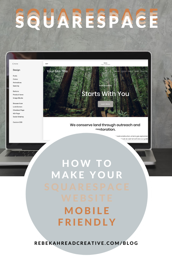
How to Make Your Squarespace Website Mobile-Friendly
Did you know that 58% of website traffic is coming from mobile these days! 😱
One of the things I love about Sqarespace is how repsonsive (and mobile friendly) it is AS you’re designing. That being said, if you like designing on desktop first, you need to check everything on mobile before you go live.


6 Simple Steps for Mobile Magic!
When you’re looking to launch your new business you have a million things to check and perfect and as a result, a mobile-friendly website may not be at the top of the list!
That being said, it’s crucial to ensure it looks great on mobile devices. Did you know that over 50% of web traffic comes from mobile users? If your site isn’t mobile-friendly, you could be missing out on up to 70% of potential customers!
Here’s how you can make your Squarespace website mobile-friendly in just 5 simple steps:
1. Use Responsive Images
Images that resize automatically can enhance your site’s speed by 25%, keeping visitors engaged. Use the built-in image blocks for best results.
2. Check Font Sizes
Make sure your font sizes are legible on smaller screens. Aim for at least 16px for body text. This small adjustment can increase readability by 40%.
3. Optimize Navigation
Keep your menu simple and intuitive. Studies show that 60% of users prefer easy navigation, leading to higher conversion rates!
4. Resize your images before you upload
Compress your images using an online image compressor to less than 500KB.
5. Test, Test, Test!
Use Squarespace’s mobile preview tool to see how your site looks on different devices. Regular testing can improve user retention by 50%.
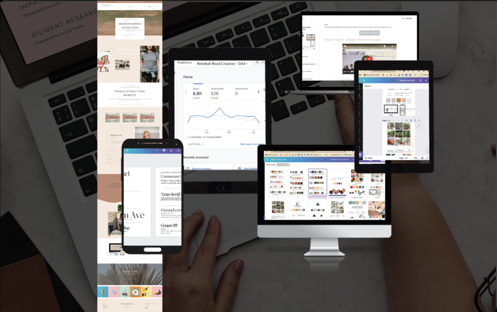
HERE’S A TUTORIAL OF HOW TO MOBILY OPTIMIZE YOUR SQUARESPACE WEBSITE IN 2025:
6. Remove any element that just doesn’t look good on mobile
This involves a little bit of code (see below), but if you just can’t make it look good, use the chrome extension “Find Squarespace IDs” and delete that element.
By implementing these tips, you’ll not only enhance your site’s appearance but also increase engagement and conversions. Don’t let a non-mobile-friendly site hold your business back!
Adding Custom Coding
There are instances when you’re going to have to work some coding magic to make your site look perfect on mobile.
Sometimes an element isn’t looking great on mobile, despite all the finessing. In this case I usually come in with a little bit of code. I’ll show you how to hide specific elements on mobile in just a bit, but first I wanted to show you how to hide an entire section.
When something isn’t looking great on mobile, I usually like to have two versions of the section that I need to edit. So for example, I will create a section that will only appear on desktop, and a section that will only appear on mobile.
To add the following code to your Squarespace website, go to Design – Custom CSS.
If you’d like to hide an entire section on mobile, use the following code:
@media screen and (max-width: 600px) {
#section-name {
visibility: hidden !important;
display: none !important;
}
}
If you’d like to hide an entire section on desktop, use the following code:
@media screen and (min-width: 600px) {
#section-name-mobile {
visibility: hidden !important;
display: none !important;
}
}
I find this to be the most effective way of making Squarespace websites mobile friendly because I don’t have to sacrifice the desktop design, and everything is totally customizable!
Sometimes it’s easier to hide a single element rather than the entire section, and in that case you can use this code:
@media only screen and (max-width: 768px) {
#block-8fc91e9563250a77172c {
display: none;
}
}
To identify the block number for the element you want to hide, you’ll need a super special Google Chrome plug in to work some magic. You can download it here.
Once you install this plug in, navigate to your site on Chrome (you can’t do this in the editor). Click on this icon in your browser, and you will get all the block numbers pop up – like magic! 😉
Copy the block number of the element you want to hide, and plug it in to the CSS.
BOOM! You’re site is looking fresh and mobile friendly.
A mobile-friendly site can lead to up to a 200% increase in mobile conversions! Make sure you are looking perfect on mobile before launch!
DIY your website in a weekend in the course
Beyond The Template
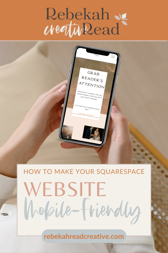
PIN THE BLOG!
Read other blogs about: Squarespace, Website Design
I’ve got messy hair and a thirsty heart.
I overshare my life, and have an ultra-expressive personality. Some words people use to describe me are: helpful, real, fun, creative, authentic, and kind.
Elphaba from Wicked is kind of my alter-ego (I was a fan LONG before the movie-adaptation - anyone else?!). I am always trying to forge my own path and make a difference in the World, somehow, someway, while also constantly criticizing myself and trying to become the better version of me.
Quality conversations + coffee come easy to me.
I’ve never had an issue connecting naturally with others (probs because I can go on and on about my life story, not that it is interesting, I just process externally...)

I find so much joy in helping and serving others and I give myself fully to whatever it is that engages me, whether that is running a 50k or creating a website in a day.


Thanks Bekah, this is great. I actually, bravely 😉😂) added a bit of CSS in the other day to make a font smaller on mobile as it didn’t translate well. If only Squarespace would shrink fonts to fit on mobile.
Hello Fiona! Proud of you for adding the CSS! This may be a better thing to do in the native Squarespace site styles. Click on the paint brush on the right upper corner, click on mobile view right next to it, click fonts, click on the text you want to change, and then adjust the size. Hopefully that helps make your font smaller!