

Transform Your Brand with Color: Interview with Katrina Hadnot
Reading Time: 3 minutes
I am so excited to introduce you to a branding EXPERT, Katrina of Lindale Studios! We are diving deep into the art of color in branding in this YouTube Interview.
YOUTUBE INTERVIEW WITH KATRINA OF LINDALE STUDIOS
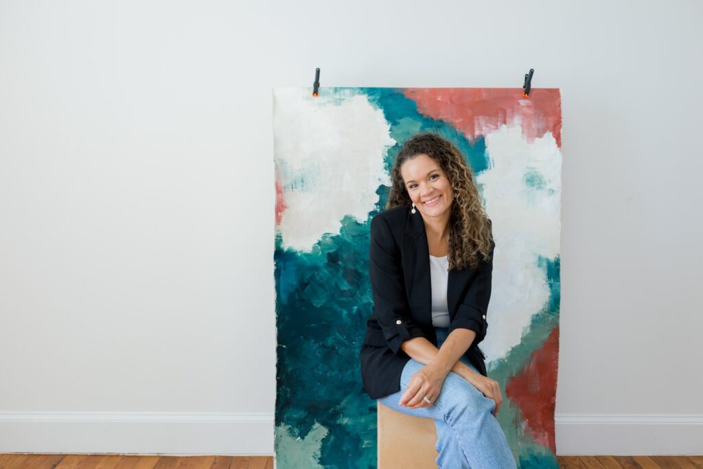
Katrina Hadnot is the heart and soul behind Lindale Studios-a studio dedicated to helping brands find their colors, educating about color and color theory, and creating hand-painted pieces and styling mats to elevate their stock photos and brands.
HERE’S WHAT WE GO INTO IN THIS INTERVIEW:
>> How where you live plays into finding inspiration for color and art in everyday life.
Katrina currently lives in Japan with her husband and three girls, due to her husband’s job. They are from the Washington DC area.
She finds inspiration from her travels through Europe and Japan, and incorporates art into everyday life in such a beautiful way. She is passionate about color, the client story, styling, and painting.
I also ask her what inspired her to focus on brand color analysis and her answer is so heartfelt.
What is the importance of color and branding?
We read color and images 60,000 times faster than text. Copy is super important, BUT having consistent colors is something that is fairly easy to put into your brand consistently.
Many times people like photographers want their work to be recognizable. Well if you’re a wedding photographer and you’re doing weddings all over, your style may look the same, but you can’t control the bridesmaids dresses colors for example, which will alter the vibe.
That being said, you CAN add your color to the background of a section on your website or to your fonts or a place on your website or your reel covers and that makes you RECOGNIZABLE, it is EASY to do, and it makes you more PERSONABLE.
We don’t own Instagram, Pinterest, etc. and you can own your colors and no one can take that away from you.
How to DIY your brand colors
For the people trying to DIY their branding and colors and have no idea of direction, Katrina will go into what she suggests they do to figure out colors.
We also chat about:
- How important is it to conduct market research before finalizing brand colors.
- What tools or resources she recommends for color selection.
- If you are trying to DIY your color palette, how many colors Katrina suggests in the palette.
- Some common mistakes brands make when selecting colors.
Is texture important in branding?
We round out the chat by talking about texture since she hand paints rollable styling mats and backdrops. We go into how this can fit into a brand and how necessary is it for the beginner.
Enjoy this interview?
Get Katrina’s Free GUIDE:
If you’re not feeling your brand really well and it isn’t conveying WHO YOU ARE, get this free download:
INSTAGRAM: https://www.instagram.com/lindalestudios
PINTEREST: https://www.pinterest.com/lindalestudios
BLOG: https://lindalestudios.com/blog/
CREATIVE PLAY FREEBIE: https://lindalestudios.com/
BRAND COLOR ANALYSIS SERVICE (60 minutes): https://lindalestudios.com/brand-color-analysis
Meet Your Solopreneur Business Cheerleader & Web Designer
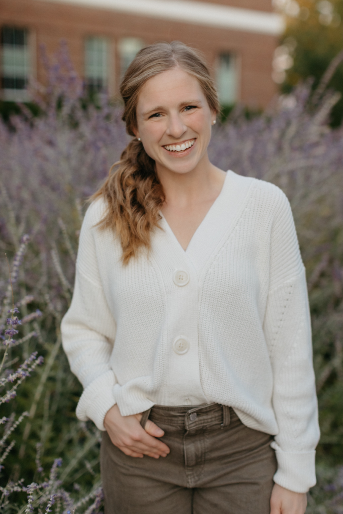
Bekah Read is a creative business owner who educates other solopreneurs on website design, search engine optimization, and how to run a peace-filled business. Bekah loves serving entrepreneurs through website in a day and her Squarespace Courses. She produces weekly blog posts and YouTube episodes.
She finds joy in being entrepreneurs’ biggest cheerleader in getting their website out into the world so it can start ranking on Google. She’s passionate about teaching you the tricks to building your brand online & skipping the marketing rat-race of instagram.
Bekah’s faith and love for a flexible schedule to work around her toddlers is what makes her so passionate to help other business owners find the joy and freedom in running a successful small business.
Her “me-time” is spent running marathons and having heartfelt conversations with friends. Fill out her contact form to work with her for a Squarespace or Showit website.
Read other blogs about: Branding
I’ve got messy hair and a thirsty heart.
I overshare my life, and have an ultra-expressive personality. Some words people use to describe me are: helpful, real, fun, creative, authentic, and kind.
Elphaba from Wicked is kind of my alter-ego (I was a fan LONG before the movie-adaptation - anyone else?!). I am always trying to forge my own path and make a difference in the World, somehow, someway, while also constantly criticizing myself and trying to become the better version of me.
Quality conversations + coffee come easy to me.
I’ve never had an issue connecting naturally with others (probs because I can go on and on about my life story, not that it is interesting, I just process externally...)

I find so much joy in helping and serving others and I give myself fully to whatever it is that engages me, whether that is running a 50k or creating a website in a day.


