3 Simple Ways to Give Your Website a Lift
Alright friend, be honest with me here… have you ever told a potential client “please don’t look at my website, it’s ugly 🫣”
The amount of times I have heard someone say variations of this or “I feel like I can’t market myself because I have nowhere to send people” is way too many to count.
And I get it! You’re short on time as a solopreneur and you can’t spend hours and hours researching how to do XYZ on (website platform).
But here’s the good news: 🎉
You can turn an “ugly” website into a money making machine with these simple steps (even if you’re not tech savvy)!
I may be a website designer, but I LOVE a go-getter entrepreneur who takes messy action and publishes the thing they need to get into the world. YOU CAN ALWAYS UPGRADE/ UPDATE IT LATER!
Here’s how to create your first website based on lessons I’ve learned from designing over 80 websites for small businesses:
1. Figure out your branding
Don’t skip this step! This is what will help you stand out from the crowd AND grow your know, like, trust factor!
Get on Pinterest and pin things your ideal client loves. Then pin things that inspire you (if you are your brand). Next, notice the consistencies in color, layout and fonts. Put this into a moodboard on Canva!
NOTE: Want me to walk you through how to do this STRATEGICALLY? Watch this free masterclass: HOW TO BUILD A STUNNING, HIGH-CONVERTING WEBSITE IN JUST 1 WEEKEND.
2. Make these quick tweaks to make your website convert
Okay first of all, if you don’t have a website, I suggest Squarespace. It is the easiest platform; trust me, I am 50/50 with recommending Squarespace or Showit, but if you’re looking for EASE and QUICKNESS, choose Squarespace.
- Have clear CTAs/ buttons that are bold in color and legible in font.
- Explain who you are, what you do, where you’re located (if location-dependent), and what sets you apart ABOVE THE FOLD! You want your website to make it VERY EASY for your audience to learn about you, why you’re the right person for them, and your services.
- Have a way to take “lesser” action on every page (showcase your freebie, stream your latest blog posts, or link your Instagram).
- Make sure you have a home, about, and contact page. Start simple! You can get fancy later and add your blog posts and services page!
NOTE: There are approximately 1 million templates and it can be SUPER overwhelming to choose. Make sure you find one that was CREATED to convert and has tutorials alongside it for a seamless website creation process.
3. Find 2 keyword phrases you can *actually* rank for
Use Ubersuggest and find 2 keyword phrases with a volume above 100 and a SEO Difficulty between 15-35. Add those phrases to your page title, meta description, and images.
Whether you have a website you love or not, I share more about user experience and SEO in my free training. ↓
NOTE: Want a walk-through tutorial of how to implement SEO on your website? CLICK HERE!
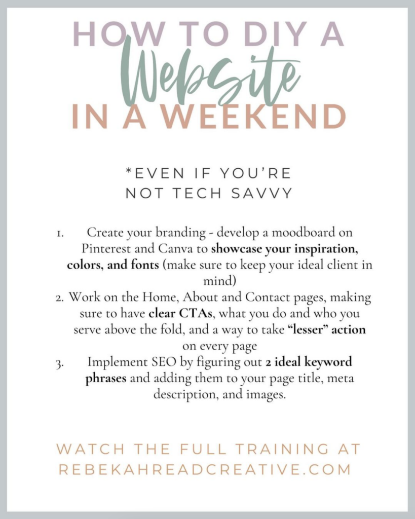
SAVE THIS GRAPHIC AS A REMINDER OF WHAT YOU NEED TO DO!

If you feel any of these statements:
❓“I have no idea where to start with my website.”
😭“I know I need a website but I just can’t fork out $4k.”
🖥️“I don’t have the time to DIY a website.”
⬆️ You’re definitely not alone!!
Here’s what a website has given me:
✔️Bandwidth to create other products while getting clients organically (aka SEO)
✔️ People booking me and saying “I feel like I know you” just off my website
✔️ Ability to take a 4 month maternity leave while still making affiliate income
✔️ A 10-20 hour work week
✔️ Not have to be consistent on Instagram
And I was in your shoes. I started off as a photographer/ social media manager/ logo designer with no experience in Squarespace or Showit.
But by learning the platform I was able:
1. Convey WHO I WAS, properly attracting ideal clients
2. Update my website when I created new offerings
3. Create helpful content for my audience that lives on forever and gets me consistent traffic
You gain more TIME when you create a website because you don’t need to be constantly marketing on social media.
Read that again ⬆️
More time.
More flexibility.
More earning potential.
More emotional energy.
^ This is what you get when you create a website that makes sales for you.
Don’t know where to start?
I’ll share the Standout Site System process to creating a high-converting website in a weekend.
The best part!? You don’t need to be tech savvy AT ALL!
You just need 40-minutes watching the masterclass: HOW TO BUILD A STUNNING, HIGH-CONVERTING WEBSITE IN JUST ONE WEEKEND.
I’ve helped 40+ business owners design a website in a day, so I can DEFINITELY teach you how to do it in a weekend!!
Read other blogs about: Website Design
I’ve got messy hair and a thirsty heart.
I overshare my life, and have an ultra-expressive personality. Some words people use to describe me are: helpful, real, fun, creative, authentic, and kind.
Elphaba from Wicked is kind of my alter-ego (I was a fan LONG before the movie-adaptation - anyone else?!). I am always trying to forge my own path and make a difference in the World, somehow, someway, while also constantly criticizing myself and trying to become the better version of me.
Quality conversations + coffee come easy to me.
I’ve never had an issue connecting naturally with others (probs because I can go on and on about my life story, not that it is interesting, I just process externally...)