
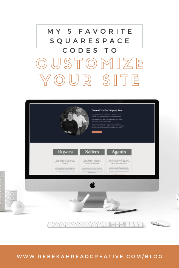
My 7 Favorite Squarespace Codes to Customize Your Site

These are my go-to codes on Squarespace to up-level any website and make it unique. DISCLAIMER: You can actually use these CSS Snippets on any site (not just Squarespace).
1. Box Shadow
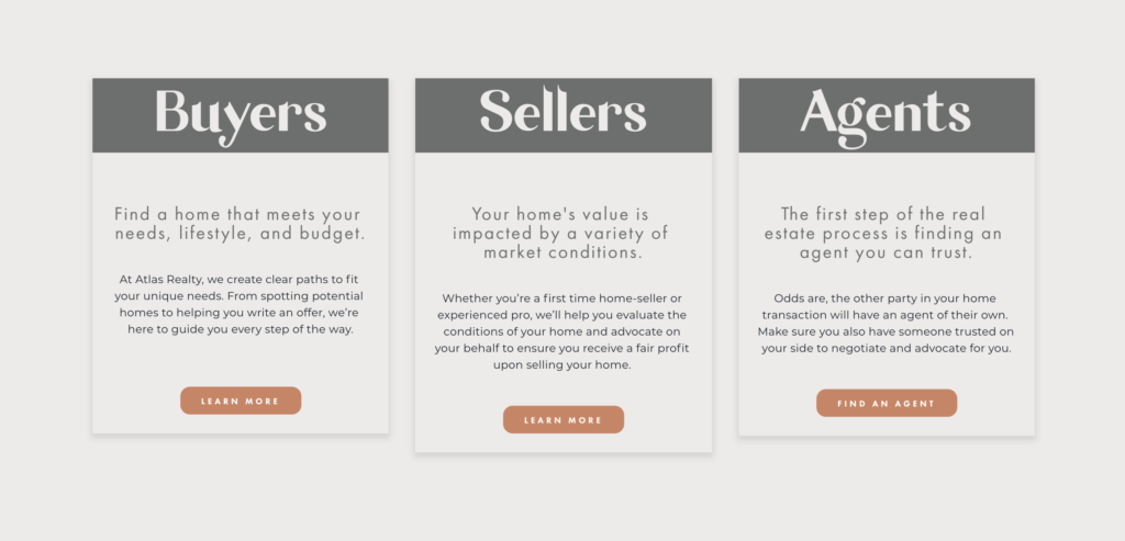
This code adds a cool drop-shadow effect to a box. First you need to figure out the block you are targeting (like the Buyers block). I use a Chrome extension called Squarespace Collection/ Block Identifier. Make sure it has access to your Squarespace site and then when you click on it, it will show the block number (appearing something like the below).
Use that #block-yui… code with the following code in your Custom CSS section in site styles and Voilà!
#block-yui_3_17_2_1_1607038895076_5426 .image-block-outer-wrapper {
box-shadow: 0px 4px 8px 2px rgba(0,0,0,.1);
}
2. Change the Heading 1 to a Custom Font

This is something I use on literally almost EVERY Squarespace website I design. First you need to upload the OTF or TTF font to site syles custom CSS and then use the following code with the URL that Squarespace provides (I titled my font Garlic, but you can name it whatever):
@font-face{
font-family:’Garlic’;
src: url(‘//static1.squarespace.com/static/5fc558c6be9b693951286cc7/t/5fc55b91f81c9a2a0c56018d/1606769553641/Garlic-Regular.ttf’);
font-weight: regular
}
h1{
font-family:’Garlic’;
}
3. Add custom font to Image Card Block

Another great one to customize your image card block, just know it will change EVER image card block across your website.
.image-title-wrapper * {
font-family: Garlic !important;
}
4. How to make your Squarespace site mobile friendly


We all know everyone is on mobile (or at least 50%-80%) so your site needs to be mobile optimized. Thankfully, Squarespace automatically does this… unless you add code.
To add the following code to your Squarespace website, go to Design – Custom CSS.
If you’d like to hide an entire section on mobile, use the following code:
@media screen and (max-width: 600px) {
#section-name {
visibility: hidden !important;
display: none !important;
}
}
If you’d like to hide an entire section on desktop, use the following code:
@media screen and (min-width: 600px) {
#section-name-mobile {
visibility: hidden !important;
display: none !important;
}
}
Sometimes it’s easier to hide a single element rather than the entire section, and in that case you can use this code:
@media only screen and (max-width: 768px) {
#block-8fc91e9563250a77172c {
display: none;
}
}
To identify the block number for the element you want to hide, use the Google Chrome plug-in I mentioned above. You can download it here.
Copy the block number of the element you want to hide, and plug it in to the CSS.
BOOM! You’re site is looking fresh and mobile friendly.
5. Create a hover on a card block
This allows the card block to move up a bit plus creates a beautiful, minimal drop shadow. Also I am all about giving credit where credit is due, so I got this code from the AMAZING Beatriz at beatrizcaraballo.com!
.design-layout-card {
align-items: center;
background-color: #fafafa;
border-radius: 5px;
box-shadow: 3px 3px 10px rgba(0,0,0,0.1);
padding: 30px;
transition: all .3s linear !important;
}
.design-layout-card .image-button-inner a {
box-sizing: border-box;
display: block;
text-align: center;
width: 100%;
}
.design-layout-card:hover {
box-shadow: 6px 13px 40px rgba(0,0,0,0.2);
transform: translateY(-13px);
}
A few more?
Those are definitely my top 5, but there are other code hacks I use occasionally.
6. Get rid of right click save as
You can put this code in the Header Code Injection in your site to disable the ability to save images on right click.
<script src=”http://ajax.googleapis.com/ajax/libs/jquery/1.3.2/jque- ry.min.js” type=”text/javascript”></script>
<script type=”text/javascript”>
$(function () {
$(this).bind(“contextmenu”, function (e) {
e.preventDefault(); });
}); </script>
7. Delete mobile hyphens
Thanks Squarespace for making my site mobile friendly, but sometimes those hyphens really annoy me. Use this code to turn off mobile hyphens.
p, h1, h2, h3 { –
webkit-hyphens: manual !important;
-moz-hyphens: manual !important;
-ms-hyphens: manual !important;
hyphens: manual !important;
}
Have other questions on how to make your Squarespace website mobile friendly? Send me an email and I’d love to help you out!
Want more codes to CUSTOMIZE your Squarespace Website? → Get the easy to implement codes!
In this freebie, I’m going to teach you exactly how and where to add customizations to your website so you can WOW your ideal client and have a website that STANDS OUT!
Related Blog Posts
- HOW TO CREATE A SQUARESPACE WEBSITE FROM START TO FINISH
- HOW TO CREATE OVERLAPPING ICONS ON SQUARESPACE (aka my FAVORITE code to use)
- HOW TO DO LINKTREE ON SQUARESPACE
Read other blogs about: Squarespace
Leave a Reply
with their Showit or Squarespace website with intentional website strategy so they can book more clients and make more money doing what they love!
Helping creative entrepreneurs


Be the first to comment